Delight
Science-Based Solution for Metabolic Syndrome and Sustainable Weight Loss
Role
UX/UI
Year
2019-2026
Overview
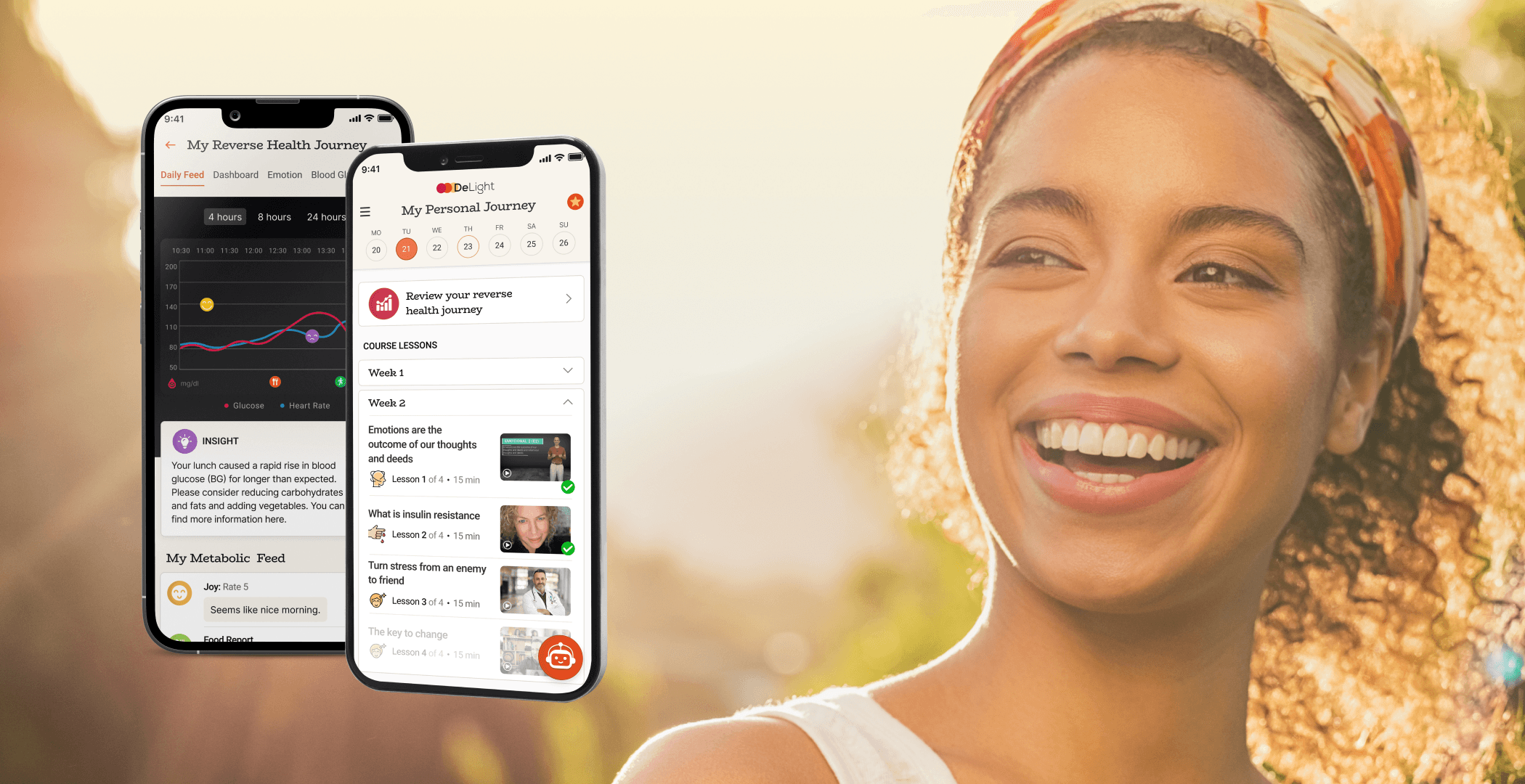
Delight is a digital health platform designed to help users improve focus and manage metabolic health through behavior change, emotional awareness, and personalized guidance.
I designed an interactive product demo and landing page to communicate the product’s value to investors — translating a complex, science-based method into a clear and engaging digital experience.
Market research
Understanding the Market
Before designing, I conducted a competitive analysis of leading health and behavior-change apps:
Noom
Levels
Keto Burn
Calory iOS app
WeightWatchers

What I found out
Most apps focus on tracking (food, weight, glucose) but lack emotional context.
Progress is shown as numbers, not meaningful personal journey
AI features are either hidden or feel generic
Behavior change is often data-heavy but not reflective
Opportunity
Position Delight as a mind–body system, not just a tracking tool.
Defining the Product Focus
After research, the core flows were defined, that would communicate the product’s uniqueness:
Emotional awareness (mood tracking)
Structured learning (courses + mentor)
Data reflection (health journey)
Continuous engagement (AI assistant)
Progress over time (habit & behavior change)
The goal was to connect data + emotion + guidance into one experience.

Wireframing
Home & AI Assistant
Continuous Engagement
Calendar-based home that encourages habit formation
“My Journey” framing creates emotional ownership
AI detects patterns and prompts timely reflection
Creates a system that feels personal, responsive, and alive


Mood Tracking
Turning Emotions into Data
Simple emotional input with clear visual cues
Intensity slider supports more accurate self-reporting
Reflection input adds personal context
Transforms subjective feelings into meaningful data
Course Experience
Guided Change
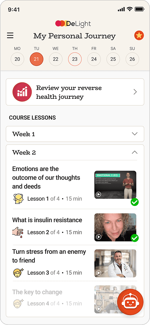
Structured weekly lessons create a clear learning path
Reflection prompts connect content to personal experience
Mentor presence (“Guru”) adds guidance and support
Makes behavior change feel guided and achievable


Health Journey
Making Data Understandable
Combines emotional, behavioral, and physiological data
Visualizes patterns across time
Highlights cause-and-effect relationships
Turns complex data into clear, actionable insight

Visual Language
The circular shapes developed from the logo became a core visual element throughout the app.
They evolve from simple brand marks into a flexible system used across screens — from onboarding to interactions and data visualization.



Accompanying the prototype, a landing page was designed to clearly communicate the core idea of the product. It presents the Delight method in a simple and structured way, combining visual storytelling with key concepts to explain how emotion, behavior, and data work together. The goal was to create immediate understanding while also establishing trust before entering the app experience.
